Zeality — Designing for VR Before It Was Cool

Junior Product Designer | 2016–2018

Summary

Zeality was an immersive VR/AR platform used by sports and media partners like the 49ERS, SF Giants and NHL Sharks.

As one of three designers, I built out UI wireframes, iconography, and animations to create a cohesive design system across both the core app and our white-labeled partner apps.

Wireframes for our dashboard

How it Started

How it Started

VR was uncharted territory in 2016. With limited user understanding, and a small team, there was much for us to achieve. The MVP iteration app had launched with the basics.

Our goal: Grow user base & identity, while testing and validating business & revenue models.

My goal was to dive in deep and learn as much possible, as it was my first product design job.

Animation I created for introducing VR and our product for our users.

Collaborated on several UI enhancements to refine user experience and interface flow.

My first task was to work on the iconography for our categories

Story board of animation

Core Obstacles:

• Users knowledge

• Lack of connected communities

• High user drop-off after first use

• High user drop-off after first use

• Sharing VR content was hard

• I knew nothing of home selling

• I knew nothing of home selling

• No best practices at the time for VR/AR

• No onboarding or user guidance

• No onboarding or user guidance

• Not a sufficient amount of great content creators in VR

• Long tedious painful sign ups

• Long tedious painful sign ups

• I knew very little of VR

Research & Discovery

My approach was attending VR conferences, testing early headsets like Oculus, and learning how other teams approached immersion by going to every VR event I could in my city. I researched, asked lots of questions in meetings and kept a sketch book with notes all the time.

My approach was attending VR conferences, testing early headsets like Oculus, and learning how other teams approached immersion by going to every VR event I could in my city. I researched, asked lots of questions and kept a sketch book with notes all the time.

As my tasks shifted more toward UI planning, our conversations and user outlines became clearer. I identified our primary audience as fans—specifically, fans of our various partners in the sports scene.

Me testing early VR Fruit Ninja

Partnerships & User Impact

Ideation & Design Validation

Ideation & Design Validation

Sketched onboarding flows, designed a 3-second animation walkthrough, and created icons for complex, abstract concepts in VR.

Created prototypes of concept app features

•Created buzz in our VR community by designing marketing campaigns

•Our process was with short turn arounds but we kept our meetings often and short

I designed this GIF as a marketing asset to build traction and direct users to Zeality’s newly launched website

A gif I designed after creating our new website

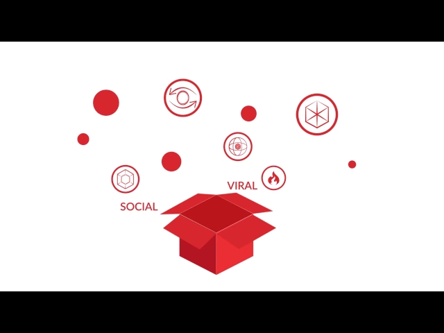
I created a short marketing video for us to create a buzz about big sports names joining the VR community

Wireframes for the content creator desktop app, I sketched

Creators Dashboard UI, by me

User Testing

• From surveys with early users to real-world testing at Oracle Park, we gathered feedback on usability and engagement to help us determine design decisions.

• There was a lot we were learning. How too quick of animations gave users motion sickness.

• From surveys with early users to real-world testing at Oracle Park, we gathered feedback on usability and engagement to help us determine design decisions.

• There was a lot we were learning. Example how too quick of animations gave users motion sickness.

Results from testing at the Giants Venue

Building a System

• Created our design library, conducted audits, and adapted visual styles for partner apps without losing brand clarity.

• Kept our brand consistent with internal updates to new branding in our system, and audits after releases

Email blast for new website release

We had many partners so it was important for us to abide by their brand guidelines

Iconography for categories by me

Design audits I did. I'm sure the dev team were not thrilled by my colorful notes.

Highlights & Outcomes

600K+


600K+


600K+


Global User Reach

100+

100+

UI Layout screens created

4 Apps

4Apps

4 Apps

Partnership with Giants, Sharks, T-Mobile, & Vikings

We got recognized by CIO Review

Reflection

What I learned:


• How to create clarity in complex, unfamiliar spaces
• The importance of asking the right questions early, and often
• That iconography and onboarding are critical in emerging tech

VR buttons for headset created by me

How it shaped me:

• This project taught me to design through ambiguity and build structure where none exists.
• Learned how to lead a product vision & test often
• It helped define how I think as a product designer today. I may not know a lot, but I will find out how to through determination and asking for help.

How it shaped me:

• This project taught me to design through ambiguity and build structure where none exists.

• Learned how to lead a product vision & test often

• It helped define how I think as a product designer today.

Community map for VR Meets

Community map we made for VR Meets

Role: Product Designer

Role: Product Designer

Role: Product Designer

Focus: Iconography, Animation, Design System

Focus: Iconography, Animation, Design System

Focus: Iconography, Animation, Design System

TimeLine: Sept 2017-2018

TimeLine: Sept 2017-2018

TimeLine: Sept 2017-2018

Next Project

Next Project

Next Project

You Made it this far. YES. I’m looking for a new 

opportunity!

kcvarela.com

made in San Francisco, CA

You Made it this far. YES. I’m looking for a new 

opportunity!

kcvarela.com

made in San Francisco, CA

You Made it this far. YES. I’m looking for a new 

opportunity!

kcvarela.com

made in San Francisco, CA